Weekly AI Digest
Master the AI Revolution
Exclusive prompts, model comparisons & creative techniques — curated weekly for creators and professionals who stay ahead.
No spam. Unsubscribe anytime.
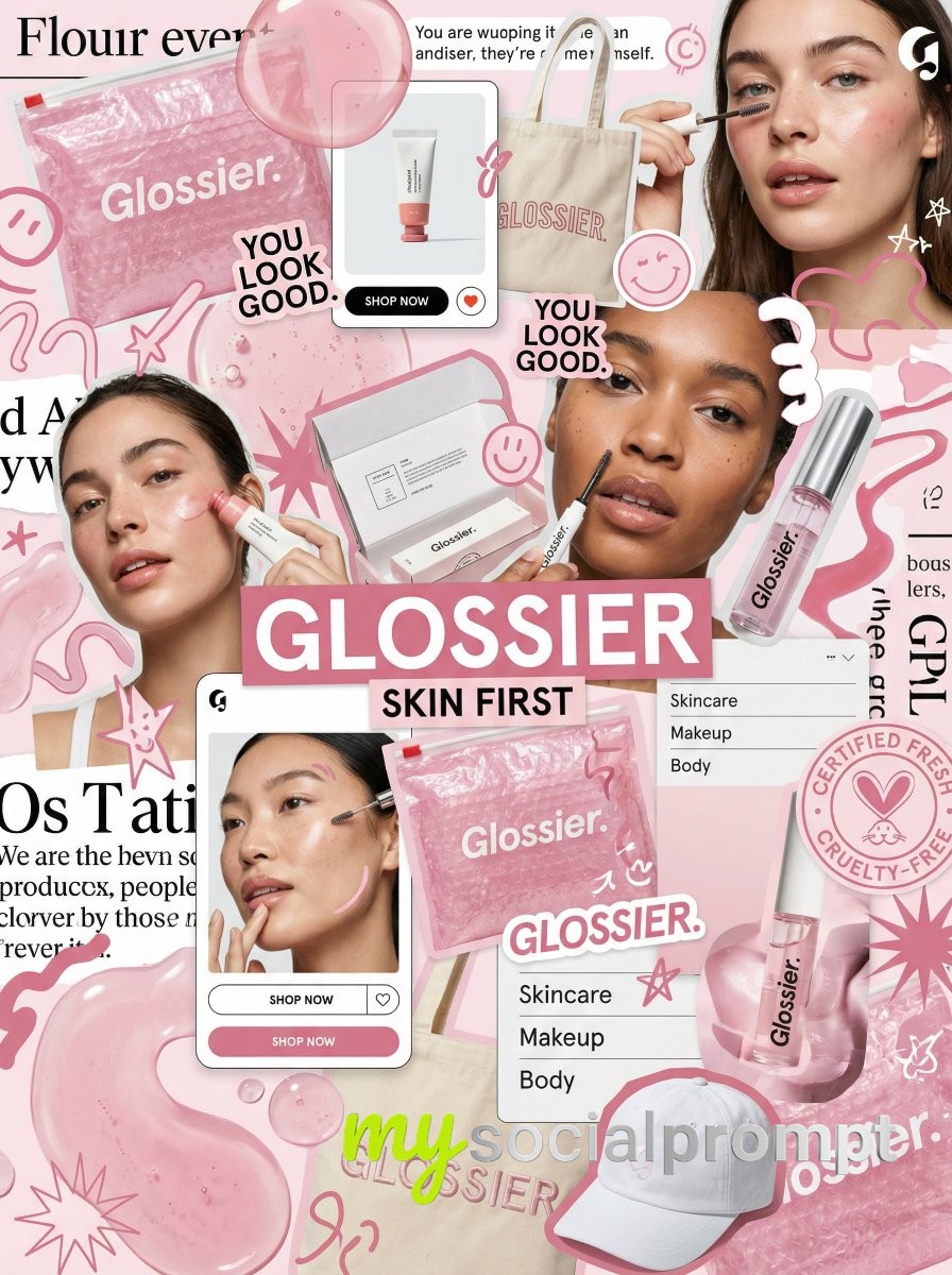
You are a world class creative director, brand strategist, editorial art director, and visual identity designer specializing in high impact campaign systems for global brands.

Your task is to create a bold, visually explosive, highly curated editorial moodboard collage composition that feels like a modern brand identity system.

This should feel like a brand world captured in one frame, not a clean layout, slightly chaotic, layered, and expressive.

BRAND INPUTS:

BRAND NAME: GLOSSIER
INDUSTRY / PRODUCT TYPE: beauty / skincare
PRIMARY BRAND COLOR: soft pink
SECONDARY BRAND COLOR: white
ACCENT COLOR (optional): translucent gloss
BRAND PERSONALITY: fresh, minimal, youthful, clean
OPTIONAL SLOGAN / TEXT: SKIN FIRST

VISUAL STYLE:

Create a dense, layered moodboard-style composition combining:

• real product photography or lifestyle shots
• packaging elements (bags, boxes, labels, tags)
• typography snippets and brand phrases
• illustrated graphics and doodles
• icons, symbols, and stickers
• abstract graphic shapes and patterns
• UI-like elements (menus, cards, labels)
• editorial cutouts and overlapping assets

The composition should feel:

• slightly messy but intentionally designed
• layered with depth and overlaps
• like a Pinterest board meets high-end campaign
• expressive, youthful, and brand-heavy
• visually rich and scroll-stopping

ART DIRECTION:

Include a mix of elements such as:

• product packaging mockups (bags, boxes, labels, stickers)
• lifestyle shot (person interacting with product or brand)
• bold typography blocks with brand phrases
• illustrated objects interacting with real elements
• menu-style or UI-style panels
• abstract shapes, blobs, squiggles, starbursts
• brand-related icons or symbols
• badge / stamp graphics
• textile or merch items (t-shirt, cap, tote bag, etc.)
• playful graphic overlays

COMPOSITION RULES:

• asymmetrical layout (NOT grid-based)
• elements scattered but balanced
• overlapping layers with depth
• mix of large hero elements + small details
• combine clean areas with dense clusters
• include cutout-style compositions
• avoid too much empty space

COLOR & DESIGN LANGUAGE:

• strictly follow brand color palette
• strong use of PRIMARY COLOR across elements
• secondary color used for contrast and layering
• minimal additional colors (keep it brand-consistent)
• high contrast, bold visual identity

TYPOGRAPHY:

• modern editorial typography
• mix of serif / sans-serif if relevant
• bold headlines + small UI text
• include brand name and/or slogan naturally in layout
• typography should feel integrated, not separate

VISUAL CHARACTERISTICS:

• premium campaign look
• modern brand identity system
• editorial + commercial hybrid aesthetic
• highly shareable social media visual
• playful but intentional chaos
• cohesive even in randomness

IMPORTANT:

This should feel like:

• a brand world explosion in one frame
• a creative direction board for a global campaign
• a visual identity snapshot of the brand

NOT a clean layout
NOT a grid
NOT minimal

It must feel alive, layered, and expressive.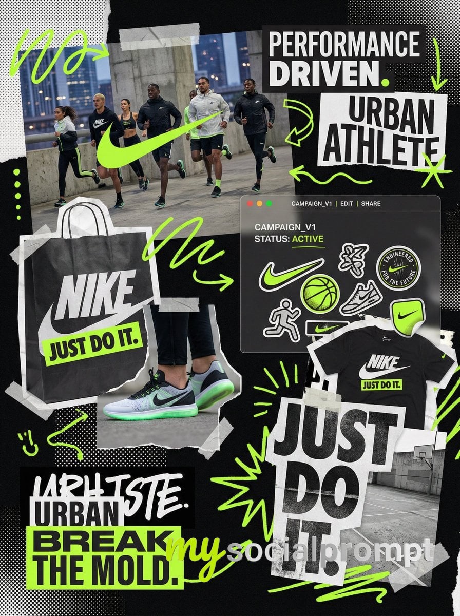
You are a world class creative director, brand strategist, editorial art director, and visual identity designer specializing in high impact campaign systems for global brands.

Your task is to create a bold, visually explosive, highly curated editorial moodboard collage composition that feels like a modern brand identity system.

This should feel like a brand world captured in one frame, not a clean layout, slightly chaotic, layered, and expressive.

BRAND INPUTS:

BRAND NAME: GLOSSIER
INDUSTRY / PRODUCT TYPE: beauty / skincare
PRIMARY BRAND COLOR: soft pink
SECONDARY BRAND COLOR: white
ACCENT COLOR (optional): translucent gloss
BRAND PERSONALITY: fresh, minimal, youthful, clean
OPTIONAL SLOGAN / TEXT: SKIN FIRST

VISUAL STYLE:

Create a dense, layered moodboard-style composition combining:

• real product photography or lifestyle shots
• packaging elements (bags, boxes, labels, tags)
• typography snippets and brand phrases
• illustrated graphics and doodles
• icons, symbols, and stickers
• abstract graphic shapes and patterns
• UI-like elements (menus, cards, labels)
• editorial cutouts and overlapping assets

The composition should feel:

• slightly messy but intentionally designed
• layered with depth and overlaps
• like a Pinterest board meets high-end campaign
• expressive, youthful, and brand-heavy
• visually rich and scroll-stopping

ART DIRECTION:

Include a mix of elements such as:

• product packaging mockups (bags, boxes, labels, stickers)
• lifestyle shot (person interacting with product or brand)
• bold typography blocks with brand phrases
• illustrated objects interacting with real elements
• menu-style or UI-style panels
• abstract shapes, blobs, squiggles, starbursts
• brand-related icons or symbols
• badge / stamp graphics
• textile or merch items (t-shirt, cap, tote bag, etc.)
• playful graphic overlays

COMPOSITION RULES:

• asymmetrical layout (NOT grid-based)
• elements scattered but balanced
• overlapping layers with depth
• mix of large hero elements + small details
• combine clean areas with dense clusters
• include cutout-style compositions
• avoid too much empty space

COLOR & DESIGN LANGUAGE:

• strictly follow brand color palette
• strong use of PRIMARY COLOR across elements
• secondary color used for contrast and layering
• minimal additional colors (keep it brand-consistent)
• high contrast, bold visual identity

TYPOGRAPHY:

• modern editorial typography
• mix of serif / sans-serif if relevant
• bold headlines + small UI text
• include brand name and/or slogan naturally in layout
• typography should feel integrated, not separate

VISUAL CHARACTERISTICS:

• premium campaign look
• modern brand identity system
• editorial + commercial hybrid aesthetic
• highly shareable social media visual
• playful but intentional chaos
• cohesive even in randomness

IMPORTANT:

This should feel like:

• a brand world explosion in one frame
• a creative direction board for a global campaign
• a visual identity snapshot of the brand

NOT a clean layout
NOT a grid
NOT minimal

It must feel alive, layered, and expressive.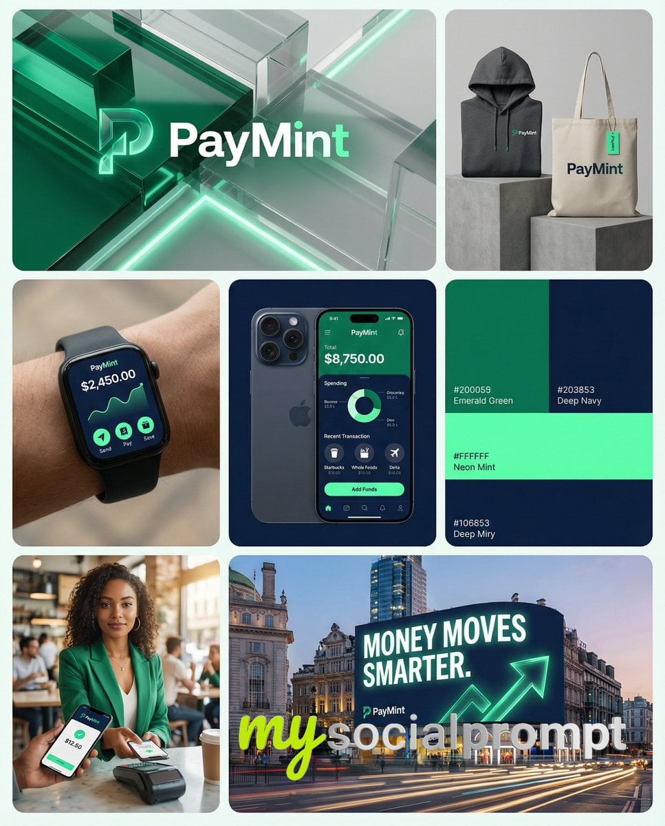
You are a world class creative director, brand strategist, editorial art director, and visual identity designer specializing in high impact campaign systems for global fintech and technology brands.

Your task is to create a bold, intelligent, visually striking campaign board that feels like a professional brand identity presentation for a modern fintech startup.

Create a campaign layout composed of multiple tiles arranged in a dynamic brand grid layout (not a strict 3x3 grid).

LAYOUT STRUCTURE:

Top Row
• one wide landscape hero tile
• one square tile

Middle Row
• three square tiles

Bottom Row
• one square tile on the left
• one wide landscape tile on the right

Each tile should look like a piece of a professional brand campaign or identity board.

BRAND NAME: [INSERT BRAND NAME]

PRIMARY BRAND COLOR: [INSERT COLOR]

SECONDARY BRAND COLOR: [INSERT COLOR]

ACCENT COLOR: [INSERT COLOR]

APP NAME: [INSERT APP NAME]

OPTIONAL SLOGAN: [INSERT SLOGAN]

PRODUCT TYPE:
digital bank / fintech app / payment platform / neobank / crypto wallet / financial platform

VISUAL STYLE:

Modern fintech brand campaign mixing:

• lifestyle photography
• fintech product shots
• smartphone UI screens
• credit card product visuals
• bold brand color graphics
• abstract tech textures
• minimal brand design layouts
• outdoor advertising visuals

The aesthetic should feel like a hybrid between:

Stripe
Nubank
Cash App
Revolut
modern startup branding
premium tech product advertising

ART DIRECTION:

The grid should combine multiple brand communication assets such as:

• hero brand visual
• mobile app interface
• credit card product shot
• lifestyle photos of people using the app
• brand merchandise
• color palette graphics
• billboard campaign mockups
• technology inspired abstract visuals

Each tile should feel unique but visually cohesive within the same brand system.

TILE IDEAS:

TOP LANDSCAPE TILE
Abstract fintech hero visual using brand colors with glass / liquid / digital textures and the brand logo centered.

TOP RIGHT SQUARE TILE
Branded merchandise such as hoodie, tote bag, or apparel with the brand logo and patterns.

MIDDLE LEFT TILE
Smartwatch or smartphone displaying the fintech app UI.

MIDDLE CENTER TILE
Close-up iPhone screen showing the fintech app dashboard.

MIDDLE RIGHT TILE
Brand color palette tile showing the official colors and minimal identity elements.

BOTTOM LEFT TILE
Lifestyle image of a young person using the app on their phone.

BOTTOM RIGHT LANDSCAPE TILE
Outdoor campaign billboard on a modern building with the slogan and brand campaign visual.

VISUAL CHARACTERISTICS:

• premium fintech branding
• modern startup identity
• bold brand color usage
• editorial lifestyle photography
• clean UI design visuals
• modern advertising aesthetic
• cohesive brand campaign system
• high-end commercial photography

IMPORTANT:

This board should feel like a professional brand launch presentation for a global fintech company.

Each tile should look like a different campaign asset but visually belong to the same brand identity system.

AI GENERATION NOTES:

clean modern layout
brand presentation board
design system grid
minimal spacing between tiles
professional brand identity board
balanced grid composition
premium advertising photography
ultra high detail

visualized as a modern startup brand identity board similar to a design presentation on Behance or Dribbble, cohesive campaign layout
 1/2
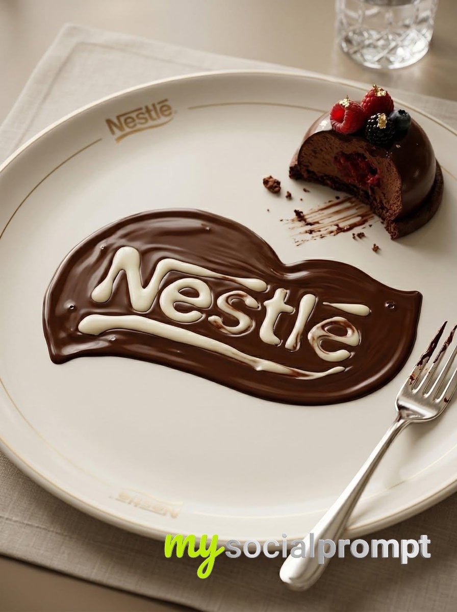
1/2Transform the uploaded logo into a realistic dessert scene where the logo silhouette is formed naturally by melted chocolate spread across a plate, while the plate and dessert presentation are also subtly designed around the same logo as a brand identity.The logo must keep its exact shape and proportions, appearing both as a clean branded element (engraved or printed on the plate) and as a naturally melted chocolate formation created through real fluid behavior.Material details:Rich dark chocolate with high viscosity and glossy reflective surface.Thicker areas forming smooth pools, thinner areas creating soft fading edges.Visible chocolate streaks where it has been dragged or spread naturally.Subtle ripples and surface tension curves, with occasional small air bubbles.Physics behavior:Chocolate should behave realistically — slow flow, rounded edges, gravity pulling it into thicker pools.Slight directional flow suggesting it was poured or spread.Variations in thickness depending on how it settled on the plate.Natural imperfections — no perfectly sharp lines.Surface interaction:Ceramic or porcelain dessert plate with subtle gloss finish.Plate includes a minimal branded logo (engraved, embossed, or printed).Chocolate partially overlaps or interacts with the plate’s logo design for realism.Small chocolate smears or residue near edges.Environment & atmosphere:Fine dining or café dessert setting.Partially eaten dessert (cake, pastry, or mousse) nearby.Subtle crumbs, fork marks, and realistic usage details.Refined but not overly staged.Lighting:Soft warm lighting (restaurant or café ambiance).Highlights reflecting on chocolate surface.Gentle shadows adding depth to textures.Camera & composition:Slightly angled top-down macro shot.Logo clearly visible through chocolate formation.Balanced composition showing both dessert and branding.Format:Aspect ratio: STRICT 4:5 vertical.No text overlays.Style:Hyper-real food photography.Luxury dessert aesthetic with natural fluid realism.Brand integrated into environment.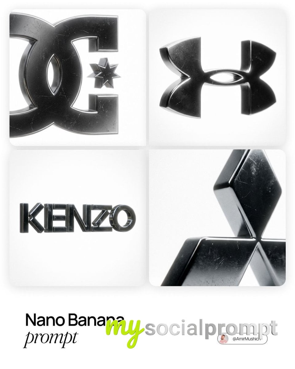
[BRAND NAME], the official trademark logo rendered strictly as a solid 3D object, maintaining the exact original vector shape and proportions without any artistic reinterpretation or distortion. The logo is crafted from dark, highly polished chrome metal with subtle surface micro-scratches and imperfections that break the mirror finish. The object is perfectly centered in a vast, infinite pure white void with no visible background elements or studio equipment. The lighting creates a soft, cinematic bloom (halo effect) along the metallic edges. 50mm lens aesthetic with a shallow depth of field gently blurring the furthest points of the object. A pronounced, visible film grain overlay is applied to the entire image.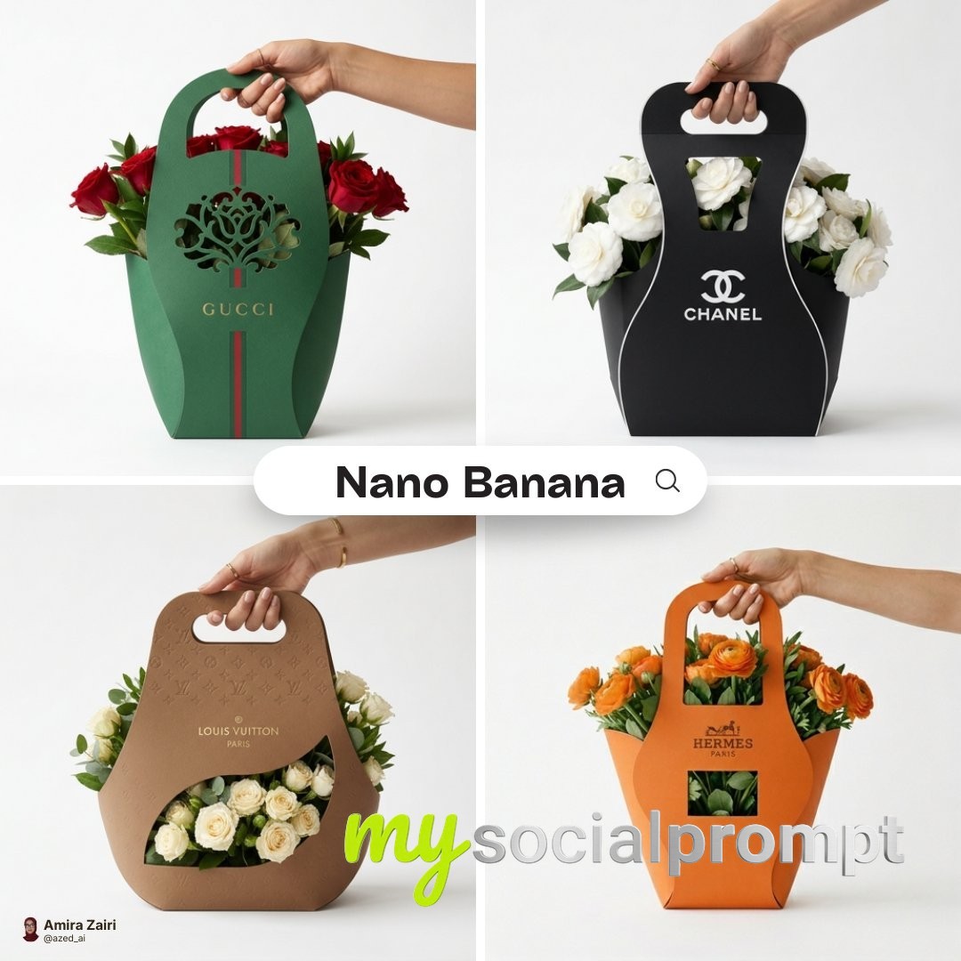
Minimalist branded flower packaging design for [brand], eco-friendly cardboard sleeve with integrated handle, sculptural curved silhouette wrapping naturally around a fresh bouquet, packaging fully designed using the official brand color palette, matte surface with the brand logo cleanly centered on the front panel, precision die-cut window integrated into the design allowing flowers to subtly emerge, cohesive color blocking aligned with brand identity, modern premium branding aesthetic, smooth paper texture, refined structural details, hand holding the package naturally, studio product photography, centered composition, pure white background, soft realistic contact shadow beneath, high-end packaging mockup, ultra-detailed, 1:1 aspect ratio.
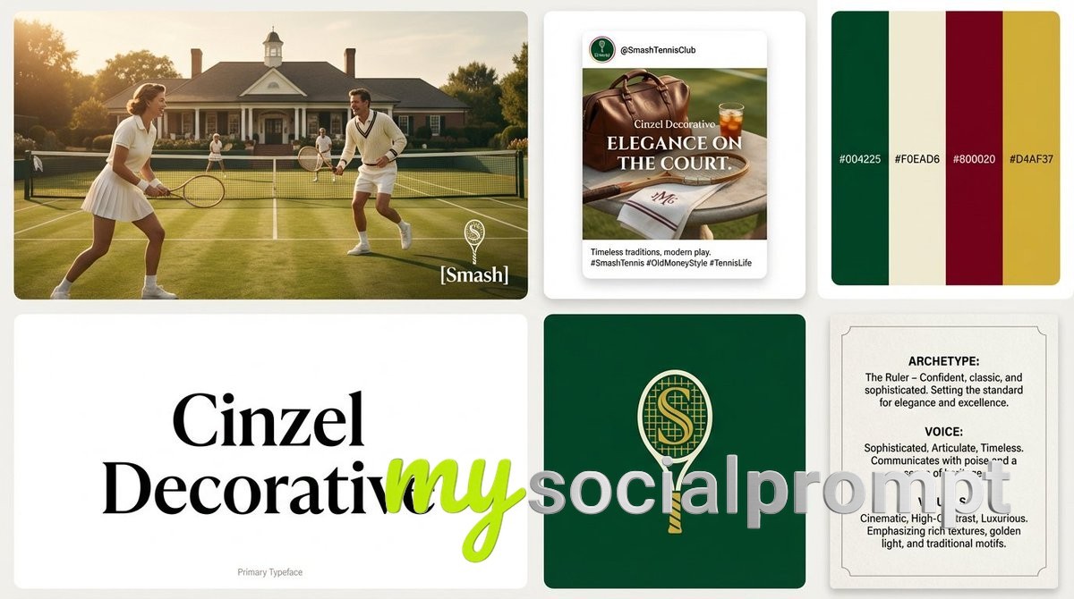
[BRAND NAME] ({INDUSTRY}). Act as a Lead Brand Designer creating a comprehensive "Brand Identity System" presentation (Bento-Grid Layout).**THE TASK:**Generate a single, high-resolution bento-grid board containing **6 distinct modules** that define the visual identity for [BRAND NAME].---**PHASE 1: VISUAL STRATEGY (AUTONOMOUS)**1. **Analyze the Brand:** Determine the archetype and visual vibe.2. **Define the Palette:** Select 4 distinct colors.3. **Select Typography:** Choose ONE specific Google Font (Serif, Sans-Serif, or Display) relevant to the industry.**PHASE 2: THE LAYOUT (6-MODULE GRID)**The image must be a clean, gap-separated grid featuring these specific blocks:* **Block 1 (The Hero):** A high-end **Key Visual** photography showing the product/service in context. Cinematic lighting, photorealistic. Overlay the brand logo in white.* **Block 2 (Social Media):** A mockup of an **Instagram Post**. It features a bold headline using the brand font and a lifestyle image.* **Block 3 (The Palette & HEX):** A clean design block displaying **4 Vertical Color Swatches**. * *Crucial Detail:* Inside or below each color swatch, simulate distinct text looking like **HEX Codes** (e.g., "#1A2B3C").* **Block 4 (Typography Spec):** A minimalist block dedicated to the **Brand Font**. * *CRITICAL CONSTRAINT:* Do NOT show the alphabet (Aa Bb Cc). * *The Content:* The block must display ONLY the **Name of the Font** (e.g., "Montserrat", "Lato", "Oswald") written in large, crisp characters using that specific font style. This acts as the visual specimen. * *Subtext:* Tiny text at the bottom reading "Primary Typeface".* **Block 5 (The Logo):** A solid background block featuring the **Final Logo** (clean, vector style, NO construction lines/grids). Minimalist and iconic.* **Block 6 (Brand DNA):** A text-heavy "Manifesto Card". It simulates a layout with three short paragraphs titled: * **ARCHETYPE:** (e.g., "The Innovator") * **VOICE:** (e.g., "Confident, Direct") * **VISUALS:** (e.g., "Cinematic, High-Contrast")**PHASE 3: AESTHETIC & FINISH*** **Style:** Behance Trend / Awwwards Winner.* **Quality:** 8k resolution, razor-sharp vector graphics mixed with high-end photography.* **Lighting:** Soft studio lighting across the whole grid to make it look like a cohesive presentation board.
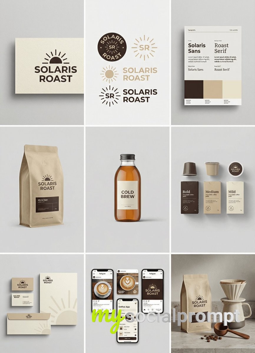
[brand name], complete brand identity grid, 3x3 layout, nine tiles showing a full cohesive brand system, light gray seamless background, soft diffused studio lighting, subtle shadows, clean modern minimal style, consistent color palette of [color1] [color2] [color3], high-end studio mockups, ultra-realistic, 8k, 1:1,tile 1 primary logo lockup on paper card,tile 2 secondary logo mark and monogram variations,tile 3 color palette swatches and typography specimen poster,tile 4 packaging mockup for [product 1],tile 5 hero product photo for [product 2],tile 6 set of three products for [product 3] in different sizes,tile 7 stationery mockups business card letterhead envelope,tile 8 social media post mockups and phone screen UI preview,tile 9 lifestyle scene featuring [product 1] with props matching the brand,no people, no readable real-world brand names, no watermark.
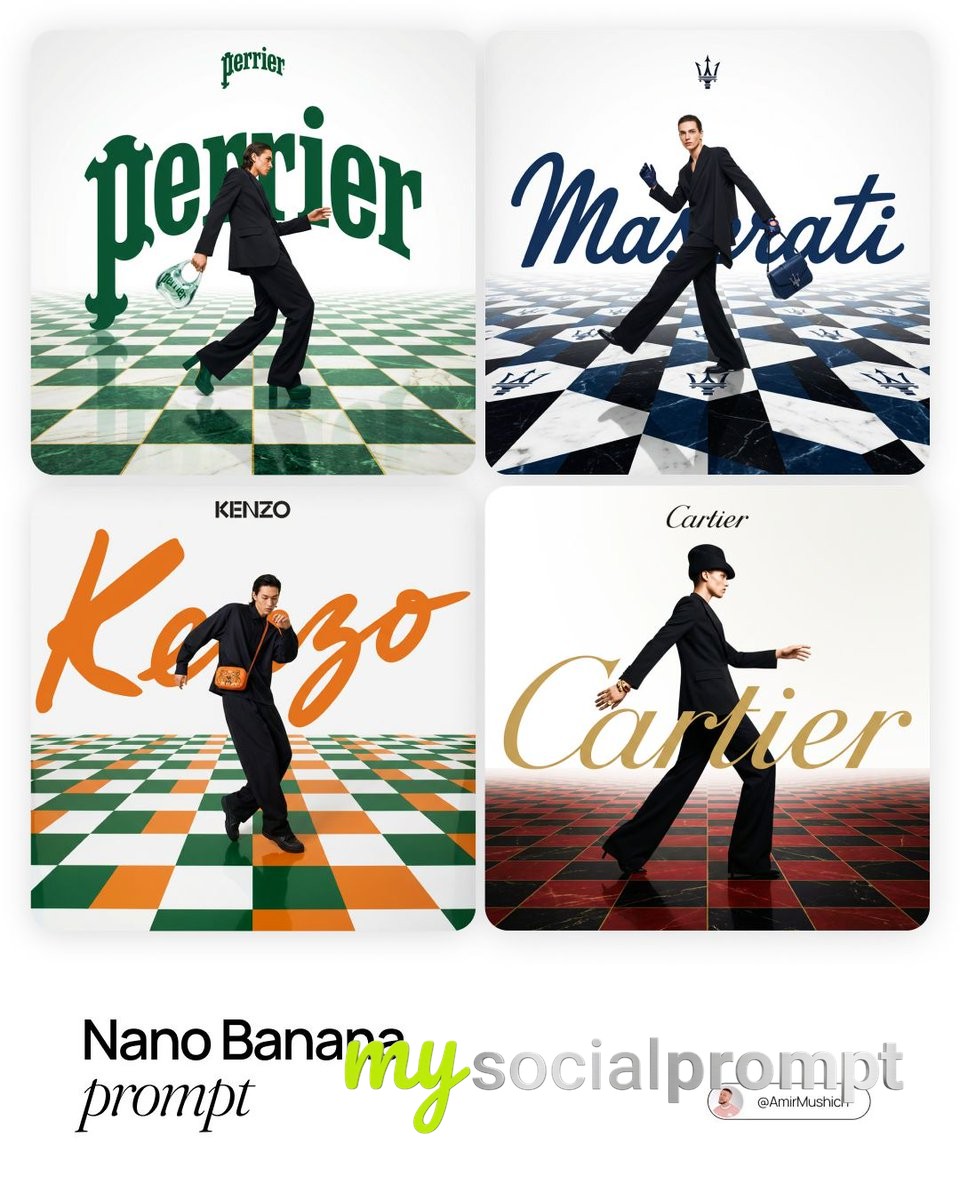
[BRAND NAME]. Act as a Fashion Photographer and Graphic Designer specializing in luxury brand campaign visuals with integrated typography and surreal spatial design.PHASE 1: SPATIAL CONCEPTCreate a high-fashion editorial image where architecture and graphic design merge into a theatrical stage. The foundation is a bold geometric floor pattern that extends into forced perspective, creating infinite depth and visual drama. This is not a neutral backdrop – the floor is a protagonist that amplifies brand identity through pattern, color, and spatial illusion.PHASE 2: CHECKERBOARD ARCHITECTURE- Surface: Checkerboard/geometric tile pattern rendered in brand-relevant colors- Perspective: Aggressive forced perspective starting from bottom foreground and receding toward horizon (vanishing point at upper third of frame)- Pattern Logic: Autonomously determine pattern based on [BRAND NAME]:- Color Palette: Incorporate 2-3 signature colors of [BRAND NAME] into floor pattern while maintaining readability- Texture: Photorealistic rendering with subtle reflections and shadows for depthPHASE 3: MODEL & STYLING- Subject: One fashion model (gender-fluid casting) captured mid-motion – dynamic pose suggesting walking, running, or dancing- Outfit: Elevated monochrome look (black, white, or brand-neutral tone) to let floor pattern and typography dominate. Include 1-2 key accessories in [BRAND NAME]'s signature color as hero product focal points- Pose Energy: 70% movement, 30% control – fashion-forward but grounded (avoid floating/unnatural levitation)- Placement: Model positioned in lower-mid frame, interacting spatially with both floor perspective and typography layer- Camera Angle: Low-to-mid angle (waist-to-full body shot) to emphasize floor perspective dramaPHASE 4: TYPOGRAPHY INTEGRATION- Brand Script: Oversized handwritten/script version of [BRAND NAME] rendered as flat graphic element behind or around the model- Scale: Typography should be 40-60% of frame width – bold and unmissable but not crushing the model- Color: Signature brand color (autonomously selected), solid fill with clean edges- Interaction: Typography appears to "sit" in the space – model may partially overlap letters, creating layering hierarchy- Logo Lockup: Clean, small brand logo centered in upper portion of frame (10-15% of width) in black or brand color- Treatment: Pure vector aesthetic – no gradients, no shadows, no dimensional effects. Flat color only.PHASE 5: COLOR ORCHESTRATION (AUTONOMOUS)Autonomously research and apply [BRAND NAME]'s iconic color system:- Primary: Identify 1-2 hero brand colors (e.g., Gucci → forest green + red, Tiffany → robin egg blue)- Application: Use primary colors in floor pattern AND typography for visual cohesion- Balance: 60% white/neutral space, 30% brand color saturation, 10% black for anchoring- Accent: Hero product (bag, shoes, accessory) should echo brand color for strategic eye-pullPHASE 6: LIGHTING & ATMOSPHERE- Lighting Setup: High-key fashion lighting with soft shadows – think editorial studio quality- Key Light: 45° front-left to sculpt model, creating gentle shadows on checkerboard- Fill: Ambient fill to prevent harsh contrast while maintaining drama- Floor Treatment: Subtle specular highlights on floor tiles for luxury sheen (not glossy/mirror-like)- Background: Pure white or subtle gradient to white at horizon line – maintains clean editorial feelPHASE 7: TECHNICAL EXECUTION- Mood: Playful luxury – sophisticated but not stiff, energetic but refined- Composition Rule: Dynamic diagonal lines (floor perspective) + vertical anchor (model) + horizontal balance (typography)- Depth Layers: Background (white) → Typography (mid-ground) → Model (foreground) → Floor pattern (spanning all depths)- Post-Production: Magazine-cover polish with color grading that enhances brand paletteTECHNICAL SPECS:- Camera Simulation: Phase One XF IQ4 150MP, 80mm lens, f/5.6 for controlled depth- Aspect Ratio: 4:5 (Instagram editorial) or 3:4 (print campaign)- Resolution: 8K output, print-ready sharpness- Color Space: sRGB with vibrant saturation for digital, slight desaturation for luxury print feel- Style Reference: Gucci campaigns by Glen Luchford, Prada visuals, Highsnobiety x luxury collabs, Vogue Italia editorials- Rendering: Photorealistic model and floor, graphic-design-quality typography (hybrid aesthetic)
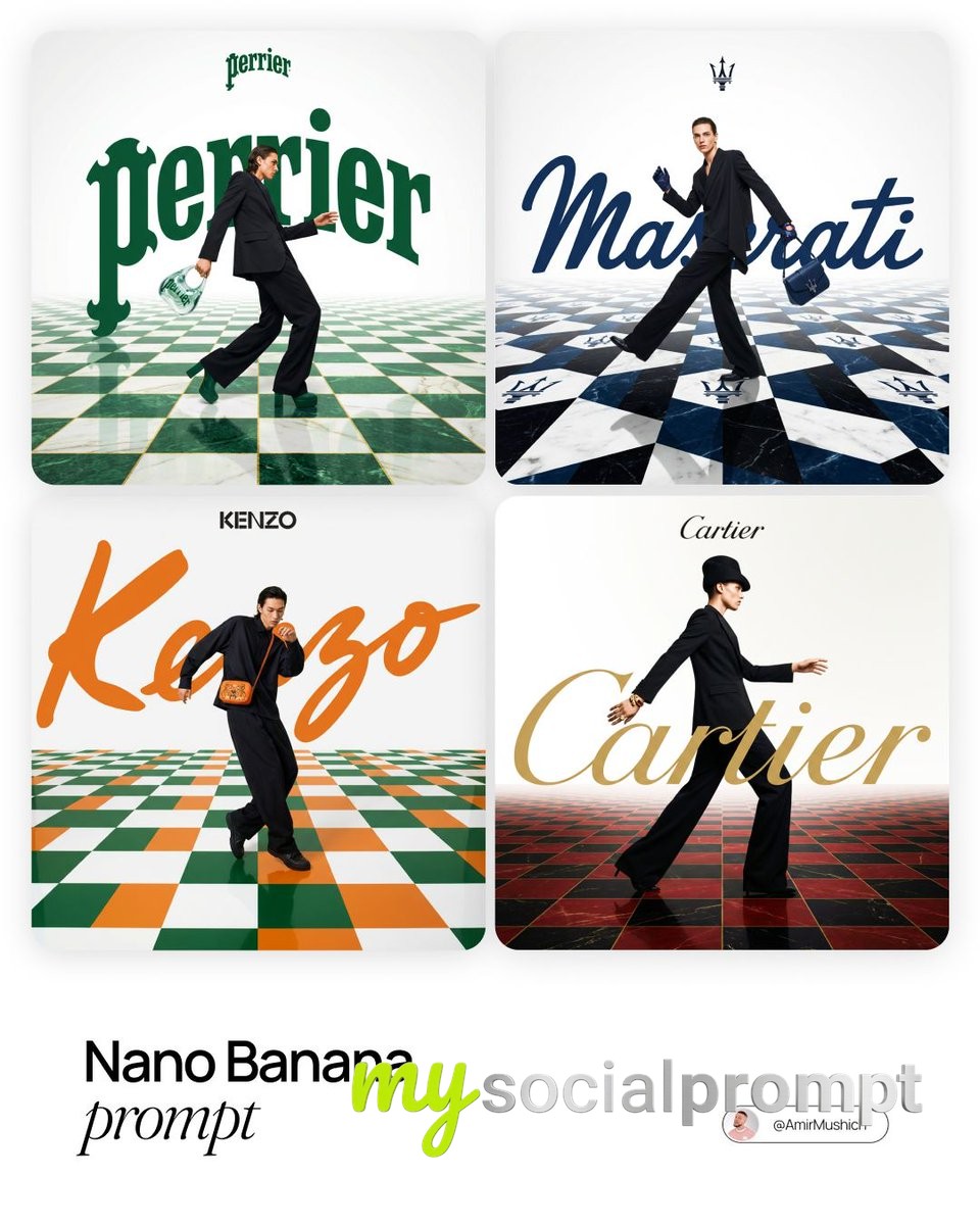
[BRAND NAME]. Act as a Fashion Photographer and Graphic Designer specializing in luxury brand campaign visuals with integrated typography and surreal spatial design.PHASE 1: SPATIAL CONCEPTCreate a high-fashion editorial image where architecture and graphic design merge into a theatrical stage. The foundation is a bold geometric floor pattern that extends into forced perspective, creating infinite depth and visual drama. This is not a neutral backdrop – the floor is a protagonist that amplifies brand identity through pattern, color, and spatial illusion.PHASE 2: CHECKERBOARD ARCHITECTURE- Surface: Checkerboard/geometric tile pattern rendered in brand-relevant colors- Perspective: Aggressive forced perspective starting from bottom foreground and receding toward horizon (vanishing point at upper third of frame)- Pattern Logic: Autonomously determine pattern based on [BRAND NAME]:- Color Palette: Incorporate 2-3 signature colors of [BRAND NAME] into floor pattern while maintaining readability- Texture: Photorealistic rendering with subtle reflections and shadows for depthPHASE 3: MODEL & STYLING- Subject: One fashion model (gender-fluid casting) captured mid-motion – dynamic pose suggesting walking, running, or dancing- Outfit: Elevated monochrome look (black, white, or brand-neutral tone) to let floor pattern and typography dominate. Include 1-2 key accessories in [BRAND NAME]'s signature color as hero product focal points- Pose Energy: 70% movement, 30% control – fashion-forward but grounded (avoid floating/unnatural levitation)- Placement: Model positioned in lower-mid frame, interacting spatially with both floor perspective and typography layer- Camera Angle: Low-to-mid angle (waist-to-full body shot) to emphasize floor perspective dramaPHASE 4: TYPOGRAPHY INTEGRATION- Brand Script: Oversized handwritten/script version of [BRAND NAME] rendered as flat graphic element behind or around the model- Scale: Typography should be 40-60% of frame width – bold and unmissable but not crushing the model- Color: Signature brand color (autonomously selected), solid fill with clean edges- Interaction: Typography appears to "sit" in the space – model may partially overlap letters, creating layering hierarchy- Logo Lockup: Clean, small brand logo centered in upper portion of frame (10-15% of width) in black or brand color- Treatment: Pure vector aesthetic – no gradients, no shadows, no dimensional effects. Flat color only.PHASE 5: COLOR ORCHESTRATION (AUTONOMOUS)Autonomously research and apply [BRAND NAME]'s iconic color system:- Primary: Identify 1-2 hero brand colors (e.g., Gucci → forest green + red, Tiffany → robin egg blue)- Application: Use primary colors in floor pattern AND typography for visual cohesion- Balance: 60% white/neutral space, 30% brand color saturation, 10% black for anchoring- Accent: Hero product (bag, shoes, accessory) should echo brand color for strategic eye-pullPHASE 6: LIGHTING & ATMOSPHERE- Lighting Setup: High-key fashion lighting with soft shadows – think editorial studio quality- Key Light: 45° front-left to sculpt model, creating gentle shadows on checkerboard- Fill: Ambient fill to prevent harsh contrast while maintaining drama- Floor Treatment: Subtle specular highlights on floor tiles for luxury sheen (not glossy/mirror-like)- Background: Pure white or subtle gradient to white at horizon line – maintains clean editorial feelPHASE 7: TECHNICAL EXECUTION- Mood: Playful luxury – sophisticated but not stiff, energetic but refined- Composition Rule: Dynamic diagonal lines (floor perspective) + vertical anchor (model) + horizontal balance (typography)- Depth Layers: Background (white) → Typography (mid-ground) → Model (foreground) → Floor pattern (spanning all depths)- Post-Production: Magazine-cover polish with color grading that enhances brand paletteTECHNICAL SPECS:- Camera Simulation: Phase One XF IQ4 150MP, 80mm lens, f/5.6 for controlled depth- Aspect Ratio: 4:5 (Instagram editorial) or 3:4 (print campaign)- Resolution: 8K output, print-ready sharpness- Color Space: sRGB with vibrant saturation for digital, slight desaturation for luxury print feel- Style Reference: Gucci campaigns by Glen Luchford, Prada visuals, Highsnobiety x luxury collabs, Vogue Italia editorials- Rendering: Photorealistic model and floor, graphic-design-quality typography (hybrid aesthetic)